
How to Choose the Right Color Palette for Your Home with Orlando Interior Design Experts
- natalie1705
- Oct 8, 2025
- 3 min read
Color can make or break a space. It’s not just about what looks good; it’s about how your home feels.
At Ducks in a Row Design Orlando, selecting the ideal color palette is a crucial - and transformative - step in our process. It’s where design flow begins, and where personalization shines.
Whether you’re building new, renovating room-by-room, or trying to bring more cohesion to your space, here’s how our Orlando interior design team helps clients create color palettes that feel timeless, elevated, and uniquely theirs.
1. Start With How You Want the Space to Feel
Before we ever pull out a paint deck, we ask: How do you want to feel when you walk into this room?
Warm and welcoming? Clean and calming? Bold and energizing?
That feeling becomes the foundation of your palette.
Relaxed tones: Soft greens, warm whites, and muted taupes
Elegant tones: Deep navy, charcoal, dusty plum
Energizing tones: Mustard yellow, terra cotta, sage, and black
Pro Tip: Color is emotional. Don’t pick a color because it’s trendy—choose it because it supports how you live.
2. Consider the Natural Light in Each Room
A color that looks amazing in one house can feel totally wrong in another. Why? Light changes everything.
We evaluate how much natural light your space gets (and what direction it faces) before selecting paint and materials.
North-facing rooms? Cooler light—warm colors help balance it.
South-facing rooms? Abundant warm light—cooler tones look crisp.
Rooms with limited light? Go warmer, richer, and avoid stark whites.
Orlando interior design tip: We always test large paint swatches on the actual wall at different times of day before committing.
3. Build Your Palette Around Fixed Elements
If you’re not starting from scratch, your home already has anchors: flooring, tile, countertops, and cabinets. These elements matter when choosing your color palette.
We work with what’s already in place or help you select new finishes during a renovation to ensure your colors complement (not compete).
Example: If your floors have a strong red undertone, we’ll avoid cool grays that might clash. Instead, we might lean into greige, ivory, or camel to bring balance.
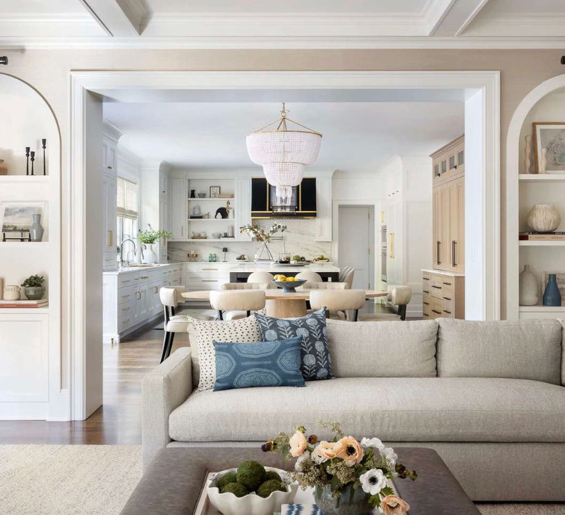
4. Use Color to Connect Rooms
This is where true design harmony happens. Your home should feel like one story, not six disconnected chapters.
We often repeat key colors - maybe it’s the soft blue from the dining room curtains that reappears in the powder room tile. Or the same brass used in kitchen hardware shows up in the guest bedroom lighting.
Pro Tip: Use 3–5 colors max throughout your home to create flow. Let one lead (usually a neutral), one contrast, and one surprise.
5. Update Seasonally with Textiles, Not Paint
Love switching things up? You don’t have to repaint.
We recommend building your base palette to last - and using textiles like pillows, throws, and decor to bring in seasonal flair. Think warm tones in fall, cooler shades in summer.
This approach is flexible, low-commitment, and keeps your space feeling fresh.
At Ducks in a Row Design Orlando, we help you go beyond guessing - and into gorgeous, thoughtful color design that works across your whole home. Whether you need help selecting paint, planning a remodel, or designing room-by-room, our Orlando interior design team brings the vision, knowledge, and experience to guide every shade and tone.
📩 Contact us today to schedule a color consultation or full-home design consult.


Comments